Harnessing hues in home decoration: Pantone fashion color trends to try in your home
As another year comes to a close, give your home an update with these relaxing and earthy colors.
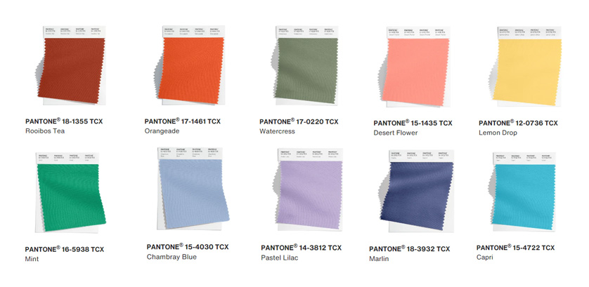
Pantone’s Spring/Summer New York Fashion Week Color Palette for 2024 features a blend of comfort and familiarity–a quieter combination in contrast to those in the 2023 palette. The line features colors with an earthy, organic appeal such as Rooibos Tea , Orangeade, Watercress, Desert Flower, Lemon Drop, and Mint, and the cooler hues of Chambray Blue, Pastel Lilac, Marlin, and Capri.
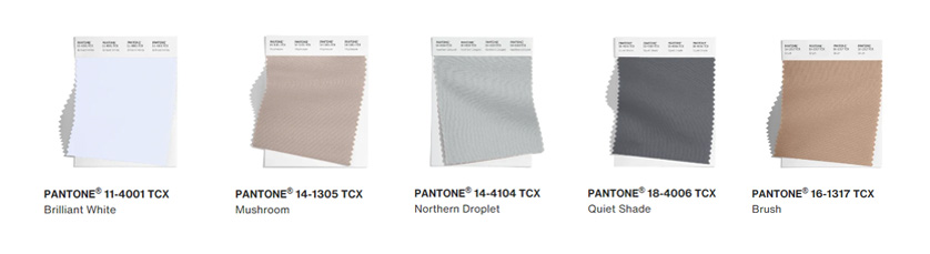
Pantone also named its new set of New York Fashion Week Classics; a neutral collection that includes Brilliant White, Mushroom, Northern Droplet, Quiet Shade, and Brush.
There is a science behind the use of color. The right hues can create the proper mood and vibe of your home. According to a feature in Architecture Design, colors stimulate you physically, mentally, and even emotionally, which is why it is very important to carefully consider your choices.
Whether you have a new space or are planning to embark on a repainting project, the tips below can help you harness the power of color in each room of your home based on Pantone trends.
Bedroom
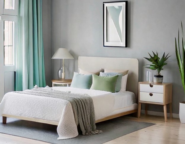
The bedroom is one of the most intimate and personal spaces in your home, and as this is where you rest and recharge, pick colors that will evoke a sense of calm and quiet.
Light blues, greens, beiges, and grays are basic, relaxing picks. Apartment Therapy notes that a light shade of blue can help you sleep better. Chambray Blue and Pastel Lilac are good options.
If you want an earthier feel, go for Mushroom and Northern Droplet. You can also go slightly deeper with Quiet Shade, Brush, and Watercress which offer a cozy atmosphere.
Living Room
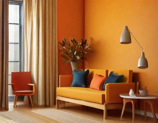
Your living room is where you receive guests and interact with the family, and thus it must exude energy, fun, and light-heartedness. Don’t be afraid to play with primary colors such as Lemon Drop and Orangeade–yellows and oranges are both welcoming and space-enhancing. If you’re looking for something just as fun but less intense, try Desert Flower.
Kitchen
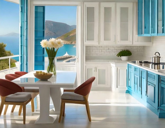
The kitchen is said to be the heart of the home, and as such, it needs to feel relaxed and open. The crispness of Brilliant White would be a classic choice and offers the chance for you to go bold and creative with your furniture and decor. For a more adventurous, retro vibe, go warm with Rooibos Red. Blues such as Marlin and Capri can offer a Greecian-inspired touch.
Bathroom
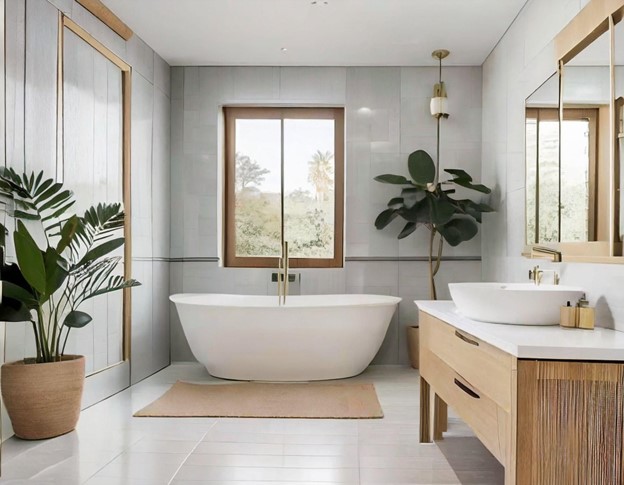
Another private space that would be fun to play with would be the bathroom. If you want it to look bigger, NYFW Classics are the way to go. You can also go for softness–try Brilliant White, Quiet Shade, and Desert Flower together. If you want something more intense, go for Northern Droplet and Quiet Shade, with a pop of Capri.
The key is having the confidence to mix and match colors, and trusting your own taste. A good paint job that gives off a personal vibe can uplift any space.