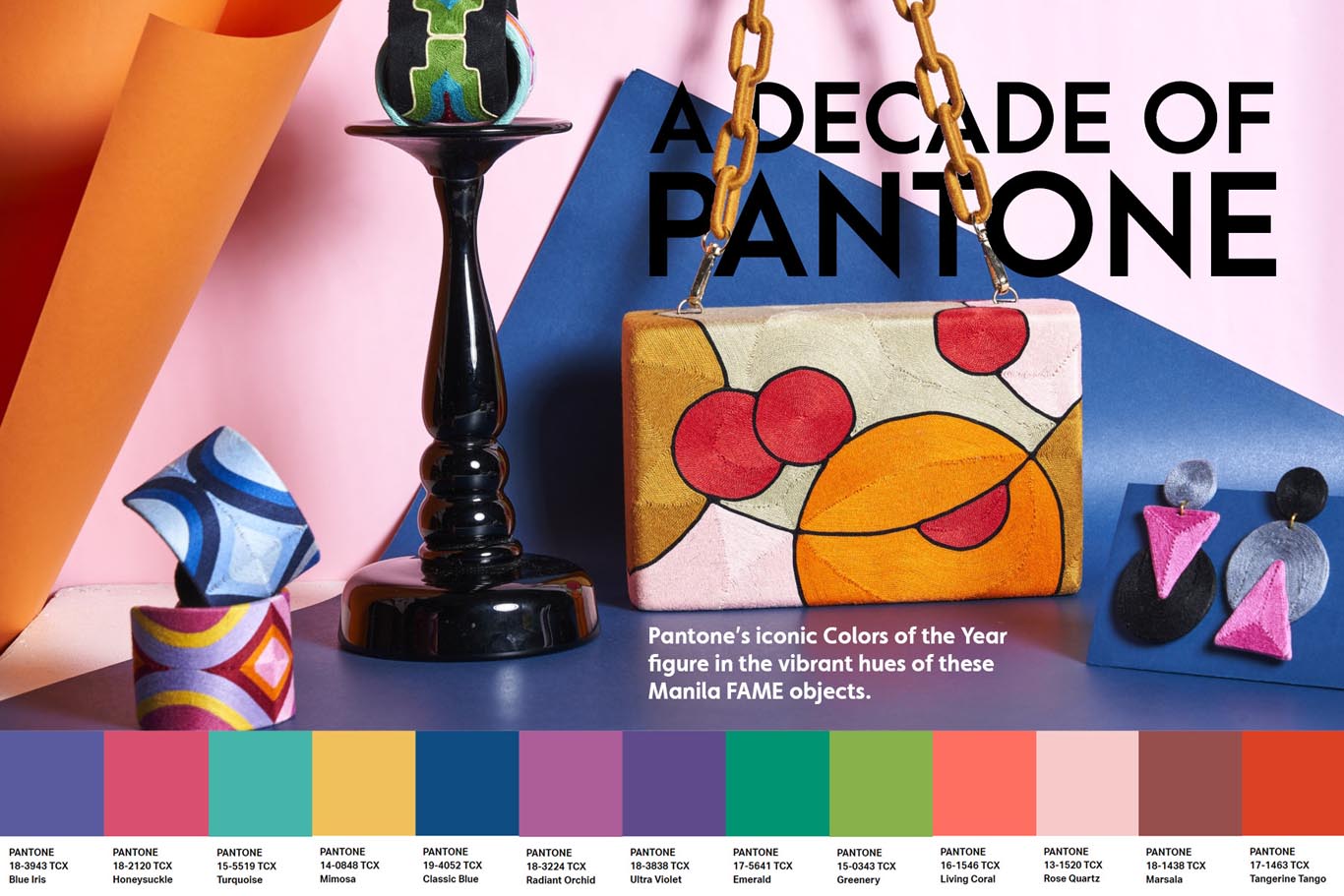
A Decade of Pantone’s Colors of the Year
Every December, designers and design enthusiasts await with bated breath for the announcement of Pantone’s Color of the Year. The chosen hue is meant to be THE color of that specific slice of time, to be used in interiors, automotive, graphic design, fashion, beauty, and more.
But how does Pantone, the World’s Color Authority, choose the Color of the Year? According to the strategicfactory.com, Pantone has a team of 20 people who comprise the Pantone Color Institute. At the beginning of each year, the team conducts a global research on patterns, designs, and colors seen in daily situations.
Each chosen Color of the Year is “…a color snapshot of what we see taking place in our global culture that serves as an expression of a mood and an attitude,” according to Strategic Factory. Before we get to 2021, let’s revisit ten years of iconic Pantone colors, as seen in these Filipino-made decorative and fashion accessories.
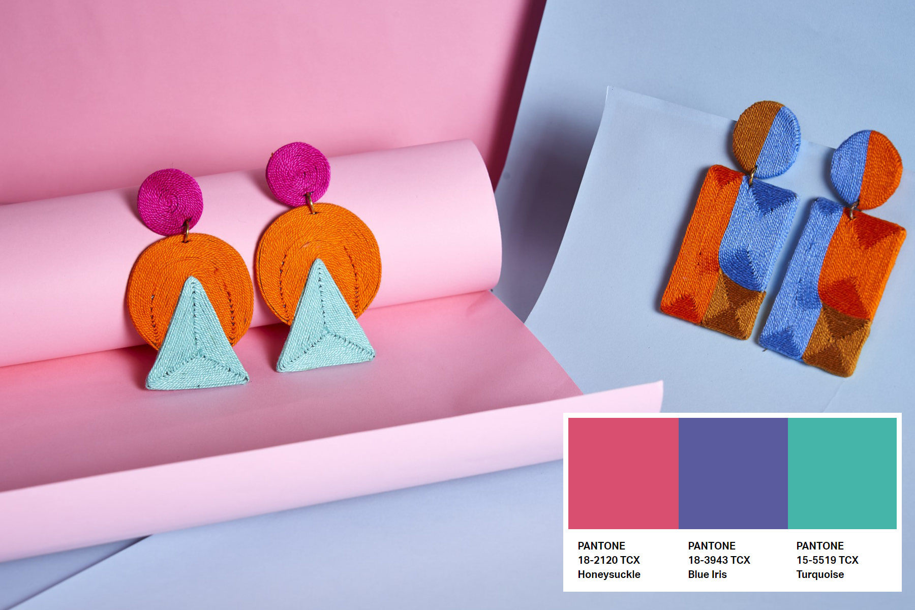 The optimistic hues of Honeysuckle and Turquoise (accented with 2009’s Color of the Year Blue Iris) add a fun bit of pop to Beatriz’s Chloe and Callie drop earrings.
2010-2011: Turquoise and Honeysuckle
The color that opened the decade was a luminous Turquoise, which according to the Pantone’s Leatrice Eiseman in 2009, “is believed to be a protective talisman, a color of deep compassion and healing, and a color of faith and truth, inspired by water and sky.” A talisman to prepare everyone for the turbulent decade ahead!
We remember Honeysuckle to be quite a polarizing color in 2011: designers either loved or hated the festive, reddish-pink hue. It was, however, applied quite well to makeup and fashion accessories (as seen here).
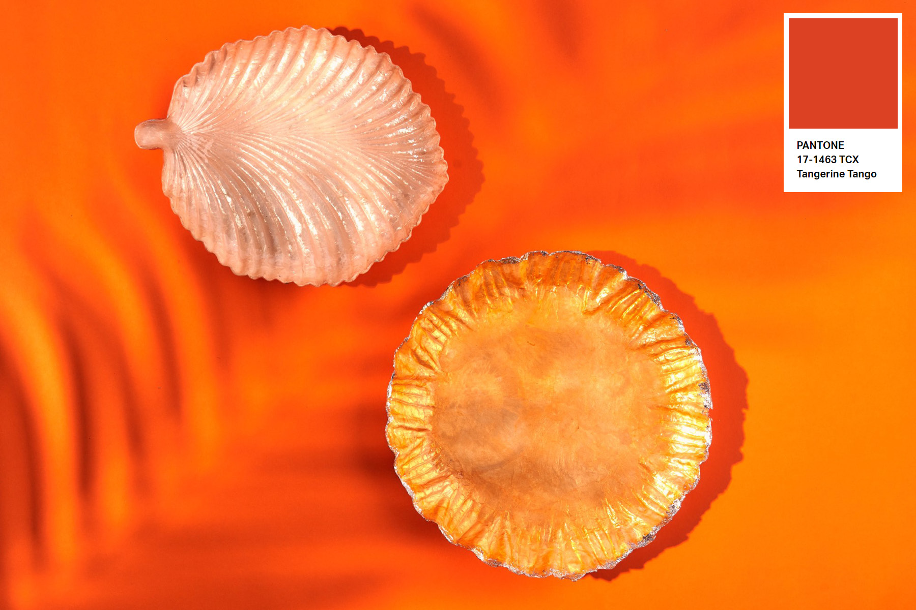 Tangerine Tango and lighter shades of citrus add a refreshing boost to service ware as seen in these capiz Orange Sunflower Plate and Blush Leaf Plate by Shell Arts Co.
2012: Tangerine Tango
Preceding Honeysuckle was yet another vibrant color, this time in an energetic and vivacious reddish orange color. The Color Authority recommended using Tangerine Tango in interior spaces: “Pillows, bedspreads, and tabletop accessories in this high-impact hue add spice to any room.”
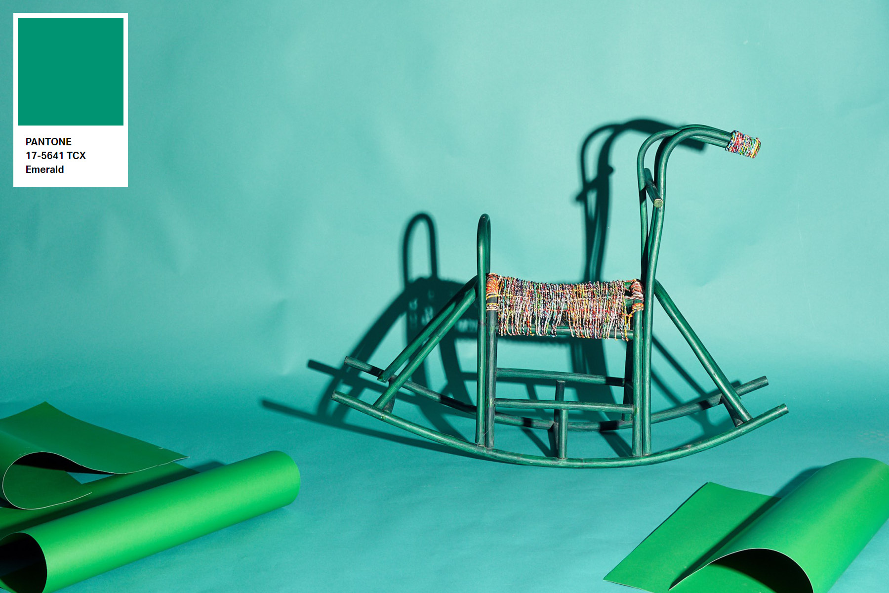 Emerald is a rich, jewel tone, but it can also go well with rustic, sustainable pieces, such as this Rocking Horse with Recycled Woven Wrapper Seat by Willie Garcia for Junk Not! Concept Store.
2013: Emerald
This lush jewel tone came at the right time, just as interior spaces and décor took on a luxurious, elegant turn. Emerald figured well mixed in with gold and other metallics, mimicked another stone—Malachite—in classic wallpaper and tabletop décor, and in bold fashion accessories.
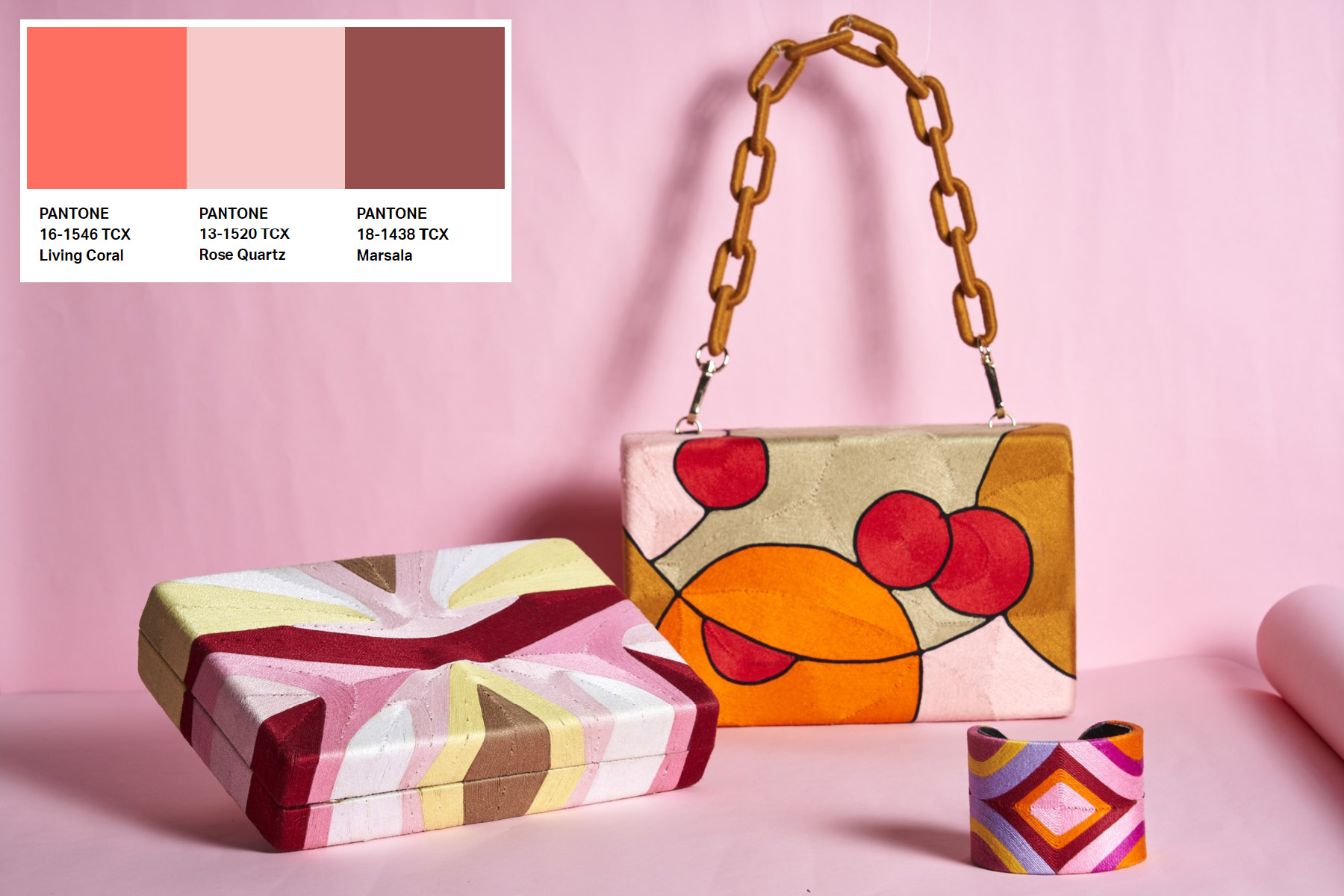 Rose Quartz is mixed in a feminine medley, (left to right) with Marsala accenting the Jane Clutch, Living Coral highlighting the Genki Bag, and a combination of all hues in the handmade BTCL0621 Cuff, all by Beatriz Accessories.
2015-2016, 2019: Marsala, Rose Quartz, Living Coral
This sweet trio spans four years. Marsala, the color of wine, has “full-bodied qualities…that make for a grounded statement color when used on its own, and a strong accent to many other tones.” This versatile color worked well in both classic and contemporary interiors, and in bold fashion looks.
In 2016, Pantone launched its first duo of Colors the Year: Rose Quartz and Serenity (a soft periwinkle blue) captured the Zeitgeist of the Millennials that year, and showed up in many homes, stores, and accessories catering to that market.
Jumping to 2019, Living Coral was a sticky-sweet hue that gave a hit of optimism towards the end of the decade, and worked best in graphic design and in personal accessories and electronics.
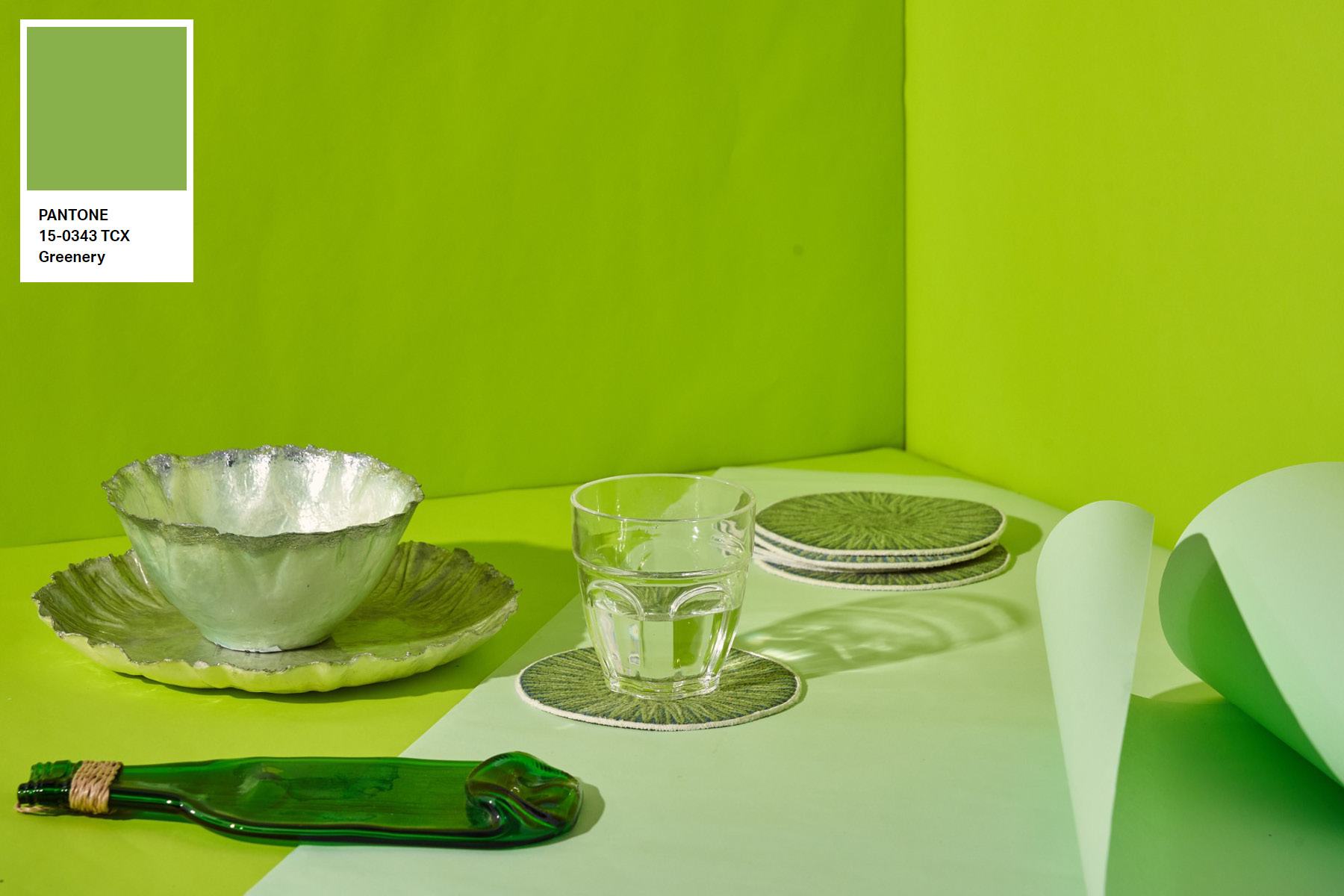 Like a fresh breeze of wind, Greenery spells summer and relaxed dinners. (Left to right): Bright green Yssa Craft Recycled Bottle Cheeseboard, Junk Not! Concept Store; celery green Sunflower Plate and Bowl, Shell Arts; band green printed sustainable Bamboo Coasters by The Olive Tree.
2017: Greenery
Greenery entered the design world like a breath of fresh air. The zesty, yellow-green hue evoked images of newly sprouted leaves, celery, and a tall, cool drink. According to Pantone’s experts, Greenery symbolized “new beginnings,” and gave interior spaces, soft furnishings, and small accessories a refreshing, tropical-modern look.
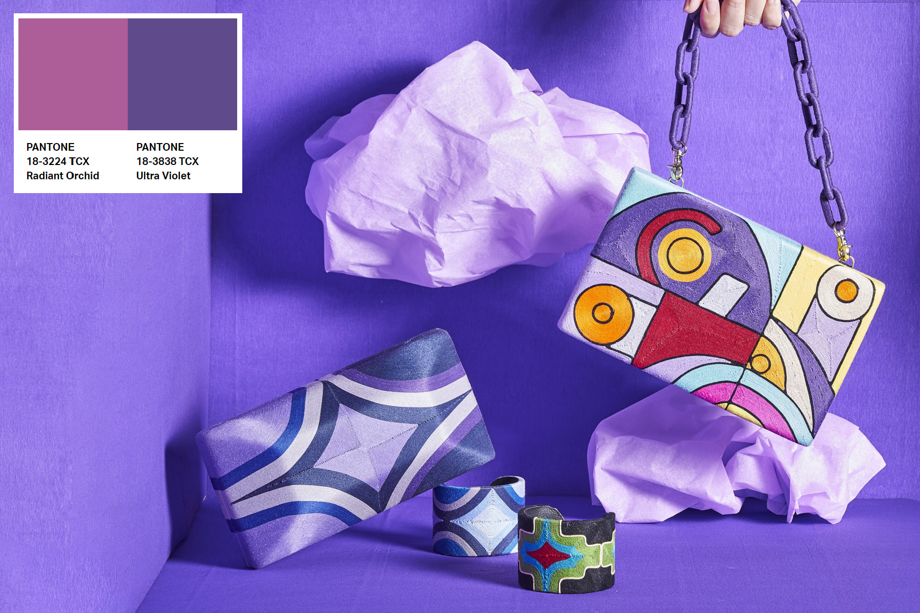 Funky, celestial-purple treats in Ultra Violet with touches of Radiant Orchid. (Left to right) Deep purple BTCL0610 Clutch, BTCL0601 and BTCL0502 Cuffs, and Zozini Abstract Bag, all by Beatriz Accessories.
2018, 2014: Ultra Violet, Radiant Orchid
The deepest purple shade encapsulated the trippy, future-forward unconventionality of 2018. This amethyst hue symbolized meditation, mindfulness, and mystic qualities; all of which were methods that helped one relax from the hectic pace of modern life.
Four years earlier, Pantone presented another purple-y color. Radiant Orchid, which exuded all the exoticism of a tropical bloom. The pretty but modern, ?ber-feminine color was shown in the Spring-Summer collections of many fashion brands that year.
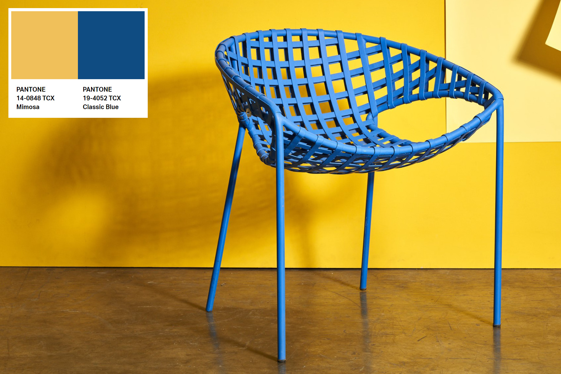 Nothing shows off Classic Blue more crisply than Zarate Manila’s Brique Chair, paired here with a background of Mimosa (Pantone Color of the Year 2009).
2020: Classic Blue
Classic Blue was chosen to symbolize “dependability and stability,” and to “usher in the uncertainty of the new decade.” Little did anyone know back then that 2020 would shake everyone’s lives to the core, with the COVID-19 pandemic.
The hue, which is as straightforward as a child’s blue crayon, is far from basic. It could work not only as an accent, but as neutral of sorts for both traditional interiors and modern furniture pieces, a seen in Zarate Manila’s Brique Chair.
Photos by Dairy Darilag; styling by Dagny Madamba and Tala Singson.


 Banner.jpg)
